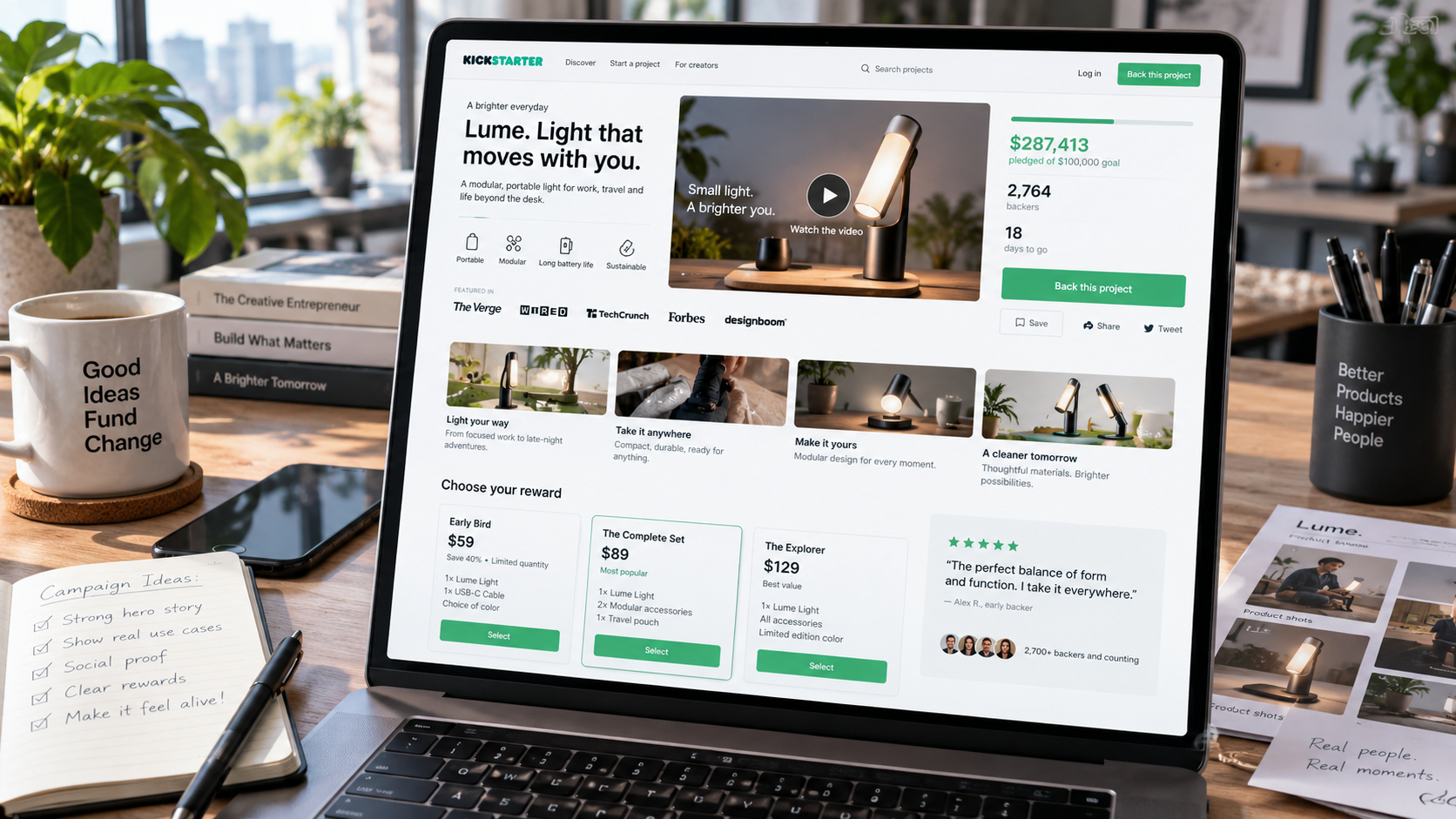
Section order, visual hierarchy and the assets that turn a crowdfunding page into a sales page - plus the mobile rules most campaigns ignore.
Contents10 sections
- 01A campaign page is a sales letter with pictures
- 02The section order that works
- 03Design for the thumb
- 04Reward tiers are a design problem
- 05The assets that do the selling
- 06Risks and challenges is a trust asset
- 07A pre-launch checklist
- 08Writing the page, section by section
- 09Common page mistakes we see weekly
- 10What to do after launch day
A campaign page is not documentation. It is a sales letter with pictures, read in one direction, by someone who can leave at any moment.
A campaign page is a sales letter with pictures
Nobody reads a campaign page. They scroll it, stopping where something catches. That means every section has exactly one job: earn the next scroll. A section that is interesting but does not move the reader toward a decision is a place where the page ends for some percentage of visitors.
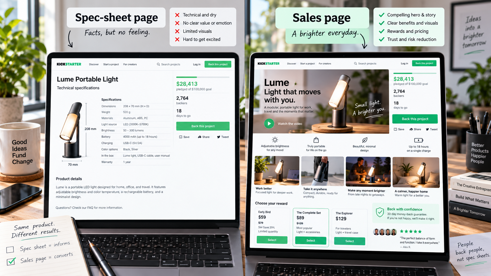
This is why pages built like spec sheets underperform pages built like arguments. A spec sheet presents information in the order the engineering team thinks about it. An argument presents it in the order doubts appear in a stranger's head.
The section order that works
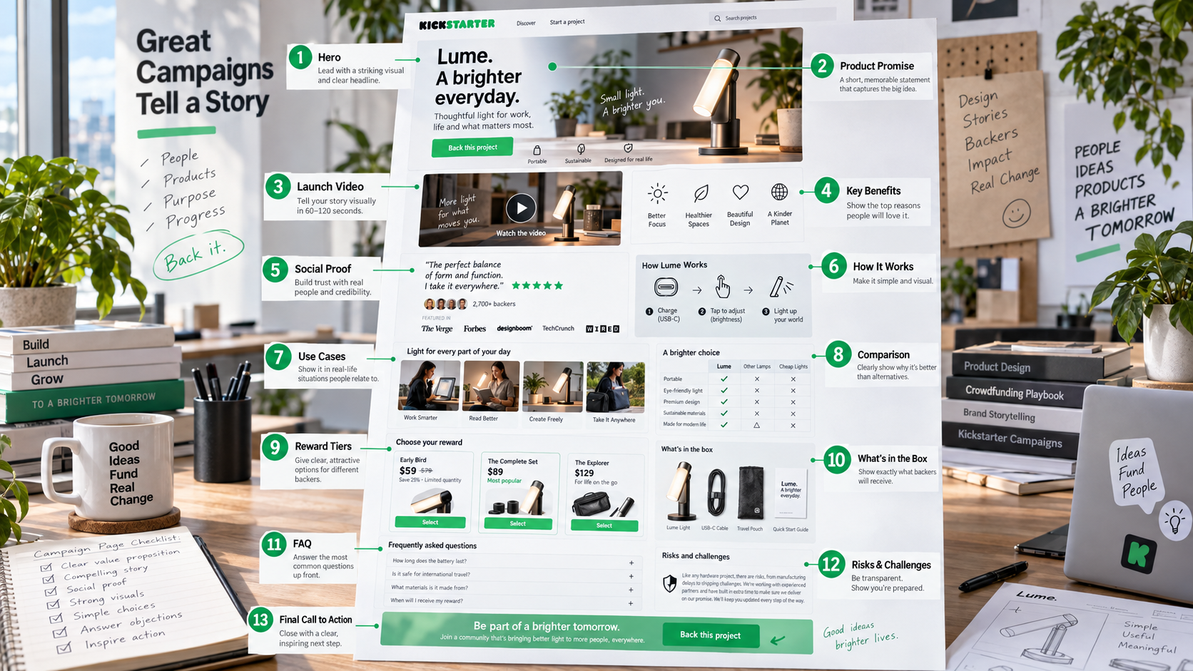
- Hero image and one-sentence definition. What is it, in plain words, above anything else.
- The video. Placed high, before the reader has to work for anything.
- The problem. Specific, recognisable, in the backer's language.
- Three benefits with visuals. Each one gets its own image or loop, not a bullet.
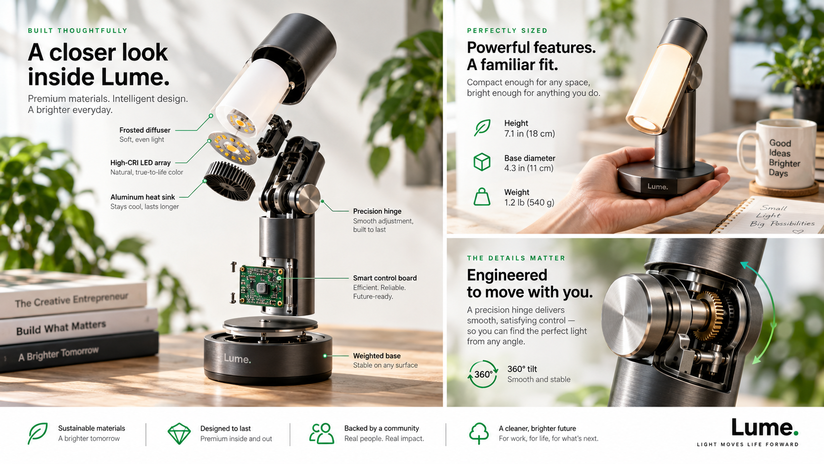
- How it works. The mechanism, ideally in an exploded or cutaway view.
- Specs and real dimensions. Numbers, weights, materials, and a scale reference.
- Comparison against the alternatives. Including the alternative of doing nothing.
- Reward tiers explained visually. Cards, not a paragraph.
- Production timeline. Where you are and what happens after funding.
- The team. Now that the reader cares.
- Risks and challenges. Written seriously.
- FAQ. The real objections, answered plainly.
- Social proof and press. Quotes, coverage, community numbers.
The most common ordering mistake is putting "why we built this" before "what it is". Founders find the origin story compelling because they lived it. A stranger cannot evaluate a motivation for a product they have not yet understood.
Design for the thumb
Most backers read on a phone, standing up, with one hand. Everything below follows from that.
- One column, always. Two-column layouts collapse unpredictably and split attention.
- No text baked into images. It becomes unreadable at phone width, and it cannot be translated or searched.
- GIF loops over long embedded videos. A three-second loop of the mechanism plays instantly. A ninety-second embed asks for a second commitment the reader has not agreed to.
- Tap targets with room. Tier cards and links need to be comfortably hittable with a thumb.
- Page weight discipline. A page full of uncompressed hero renders will lose readers on mobile data before it loses them on content.
A quick test that catches most of it: open your draft on your own phone, on cellular, and scroll it once without zooming. Anything you had to pinch is broken.
Reward tiers are a design problem
Reward tiers fail visually far more often than they fail commercially.
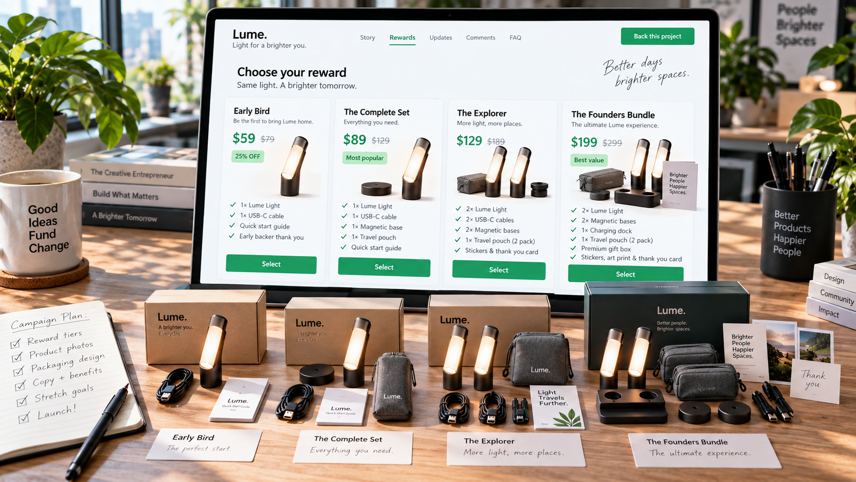
- Visual tier cards. Each tier shows exactly what is in the box, as an image, not a sentence.
- An anchor tier. A high tier that makes the main tier look reasonable.
- One obvious best value. Label it and design it to stand out. Ambiguity at the tier is where momentum dies.
- Six tiers maximum. Beyond that, choosing becomes work, and work at the moment of decision reduces pledges.
- Add-ons kept separate. They should extend a decision, never complicate the first one.
The assets that do the selling
Every visual on a campaign page should answer a question the reader is already asking.
| Asset | The question it answers |
|---|---|
| Exploded view | What is inside it, and is it engineered or assembled? |
| Scale reference next to a familiar object | How big is this actually? |
| Colorway grid | Which one would I own? |
| Looping detail animation | Does the mechanism work the way I think? |
| Lifestyle context | Where does this fit in my day? |
| Manufacturing and tooling stills | Is this real, or is it a render of an idea? |
If you cannot name the question an image answers, it is decoration - and decoration is page weight that pushes the ask further away.
Risks and challenges is a trust asset
Most campaigns treat the risks section as a compliance box. Written properly, it raises conversion, because it is the only place on the page where you are visibly not selling.
What makes it work: naming your manufacturing partner, stating tooling status honestly, describing what has already been solved and what has not, and explaining your contingency for the two most likely delays. Backers have been burned before. A founder who describes the risk in specific terms reads as someone who has thought about it, which is exactly the signal the section exists to send.
Vague reassurance sounds like a risk. Specific problems, named and addressed, sound like a plan.
A pre-launch checklist
Fifteen things to confirm before the page goes live.
- Hero image reads at thumbnail size and shows the product, not a lifestyle scene.
- One-sentence definition sits above the fold, in plain language.
- Video is embedded high and its first frame works as a still.
- Three benefits, each with its own visual proof.
- Exploded or cutaway view present.
- At least one shot showing real physical scale.
- Full specs, with dimensions and weight, in a table.
- Comparison against the main alternative, including doing nothing.
- Four to six tiers, each with a visual card.
- One tier clearly marked as best value.
- Shipping timelines and regions stated, with any known caveats.
- Production timeline showing current status.
- Risks section naming partners and tooling status.
- FAQ answering the six objections your pre-launch inbox actually raised.
- Whole page read once on a phone, on cellular, without zooming.
The last item catches more problems than the other fourteen combined.
The page is downstream of two other things: the film it is built around, covered in the anatomy of a launch video, and the schedule that gets the assets finished in time, covered in the pre-launch timeline.
Writing the page, section by section
The page is designed and written at the same time, because the copy determines what the visuals have to prove.
The one-sentence definition. Product category first, differentiator second, in language a stranger would use. Not "the future of hydration" - "a 700ml insulated bottle that opens with one hand".
Benefit headings. Each benefit gets a heading stating an outcome, then one short paragraph, then the visual. Three sentences of copy per benefit is usually plenty; the image is doing most of the argument.
Specs. A table, not prose. Include weight and dimensions in both metric and imperial, materials by name, battery capacity where relevant, and compatibility. Backers who read specs are your most likely buyers, and vague specs read as evasion.
Comparison. Name the alternatives, including the honest one: doing nothing. A comparison table that only flatters you convinces nobody; a table that concedes two points and wins five is credible.
FAQ. Take the six questions your pre-launch inbox actually asked. Not invented questions - real ones, in the words they arrived in.
Common page mistakes we see weekly
- The origin story before the product definition.
- A wall of renders with no explanatory copy between them.
- Text baked into images, unreadable on a phone and impossible to translate.
- Reward tiers described in paragraphs instead of shown as cards.
- No scale reference anywhere on the page.
- Shipping dates hidden at the bottom, below the risks section.
- Press logos with no quote or link behind them.
- A page that is visually excellent for three screens and then becomes a specification dump.
What to do after launch day
The page is not finished when it goes live. Two edits are worth making in the first week, once you have real traffic data. First, move whatever objection your comments and messages raise most often up into the top third of the page. Second, add social proof as soon as it exists: funding milestones, backer counts, press coverage, community numbers. A page that showed no proof on day one should show plenty by day five, and that change alone tends to lift the conversion rate of colder, paid traffic arriving later in the campaign.
Frequently asked questions
What should go at the top of a Kickstarter page?
The top of a Kickstarter page should carry one strong product image, a one-sentence definition of what the product is, and the video. A backer's first question is always what am I looking at, not why did you build it. Origin stories, mission statements and team introductions all convert better further down, once the reader knows what is being offered and has decided it might be for them.
How many reward tiers should a campaign have?
Most campaigns work best with four to six reward tiers. Fewer than three removes the anchoring that makes the main tier look like the sensible choice; more than six creates a comparison task that backers abandon. Each tier needs its own visual card showing exactly what is in the box, and one tier should be unambiguously the best value so the decision is easy to make on a phone.
Does page design really affect funding?
Page design affects funding because a campaign page is the only sales conversation most backers will have with you. The same product, the same video and the same price can convert very differently depending on section order, mobile legibility and how clearly the reward tiers are presented. Design here means the order objections are answered in, not decoration.
Should the page be different on Indiegogo?
The structure of a page should stay the same on Indiegogo, but the emphasis changes. Indiegogo traffic skews later and more paid, so shipping clarity, comparison against alternatives and social proof carry more weight, and the flexible funding and InDemand mechanics need explaining on the page itself. The section order that works on Kickstarter still works - you are simply answering a slightly more sceptical reader.